It’s easy to assume that printed music is more or less all the same – notes are notes and that’s that, right? In fact, there are countless decisions that go into making printed music, and those decisions can mean the difference between something that better helps us to learn and understand, and something that discourages and confuses us.
I myself never gave much thought to how my beloved music books came to be until I saw this incredible video a number of years ago. Little did I know the staggering amount of care and craftsmanship involved in making just a single page:
What a revelation! I should have known there was a reason why I always loved working out of Henle books, but I kind of always dreaded using Schirmer editions.
What makes the Henle editions so great are the clarity with which they present the music. Take for example the opening measures of Brahms Ballade for piano, Op. 10 No. 2.
First, the Schirmer edition:

and here is the same passage from the Henle edition:

The most striking difference is the visual fidelity in the Henle edition. Take a look at the sharp signs, the treble clef, the staff itself. Everything is just more ‘in focus’ in the Henle:
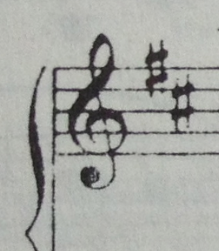
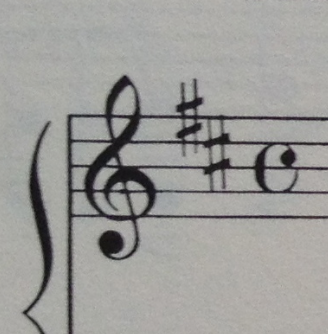
These might seem like trivial differences here on the screen, but any performer or student who studies these pages for hours on end will tell you that the difference is quite practical. These pages are simply easier to look at.
Even more importantly, notice the decisions made by the layout editor. The ‘espresso e dolce’ is placed above the staff, which removes clutter from the middle of the staff. The curve of the slur in the 3rd and 4th measures reflects the slur from measures 1 and 2. In the Schirmer edition, the curve is flatter, and it seems to ‘trap’ the notes underneath it. The extra width of measure 4 in the Henle helps to communicate the extra length of the dotted quarter figures. There is no left hand rest in the 4th measure. The list goes on..
Just about everything in the Henle edition seems less confined and more free. And it all comes down to little differences that keep adding up.
The attention to detail and clarity, the insistence on removing all unnecessary clutter is what sets the Henle editions apart. And the benefit is not purely visual.
By doing so, these editions help the printed music, ironically, to almost disappear. Printed music is not music, it’s a tool – it’s a means to an end. And like all good tools, it shouldn’t distract the person using it or call attention to itself – it should exist to serve and it should be intuitive. Good written and printed music doesn’t call attention to itself. Instead, it makes us forget that we’re reading music, and allows us to move one step closer to simply experiencing it.
